|
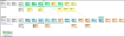
eHealthInsurance Small Business Group eHealthInsurance provides health insurance brokerage services online. They have three major audience groups: Seniors, Individual/Family and Small Business. eHI came to Imagesmith wanting to focus just in the Small Business division, as this was their main focus for long term success and sales increases. eHealthInsurance's Small Business Group division (SBG) required an assessment and revision of their existing user flow, a redesign of the entire site for improved usability, increased registration process completion rates, and aesthetic enhancements to the information design and layout of the section. The aesthetic redesign and HTML code would then be reused throughout the site. A team of Imagesmith staff and contractors worked on this project for about three months, from mid-August through November 2000. I was the Information Architect, Chip Street (now part of Group of People) was Account Manager, Susan Down Project Manager, Erik Watts contract Designer, and Novak Rogic (now also part of Group of People) HTML Producer. The eHI team was comprised of two senior-level product managing individuals—our main contact and her colleague. We also had audiences of several VPs and other product managers (for the other divisions, Senior and Individual/Families) for some presentations. This project was very exciting and wonderfully effecient throughout because our client decision-makers were very Web-savvy and well organized. This meant that there was little educating to do, decisions were made quickly, and compromises accepted smoothly. At least within the closer-knit team. The Process The SBG application is a tool to allow customers to come to the site, and after providing information and answers to multiple form fields, presents them with a broad array of insurance plans to compare and choose from. We began the project with a usability audit of the existing SBG application flow. This gives the project team a better understanding of the scope of the project, and it usually allows the client to become more sensitive to usability issues—and more of a champion for usability throughout the project. eHI had also created a proposed revision to their existing flow, which I compared and mapped out for them. This map accompanied the audit and presentation.
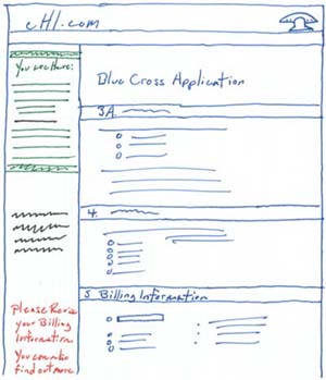
After presenting these comparisons, the eHI team quickly realized that their goal of making the experience simpler and quicker wasn't being accomplished with their proposed flow. To give them credit, though, their proposed flow did a lot more than the existing, and for some actions would streamline parts of the process. After presenting to the team and larger group of VPs and product managers at eHI, we moved forward in rebuilding the SBG flow, and beginning the redesign of the site. This project diverged from my normal process in that I didn't provide wire frames to the designer to build to. Instead, we met together very early in the project (this is always a good thing, regardless of deliverables, as it brings together diverse thinkers and roles on the team and can typically result in much more robust solutions for the client) so I could discuss what I needed in regards to information and layout. I provided Erik Watts with an ingredients list (a list of the elements on a page—the things that make it up) for the eHI home page and for the SBG landing page. From this, a sketch I made, and a discusssion with him of my vision for the metaphor for the site, he produced a wire frame which I then rebuilt in PageMaker to develop the paper prototype. Ingredients List Sample (PDF 8K)
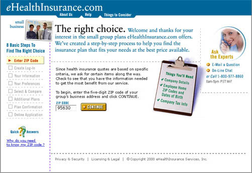
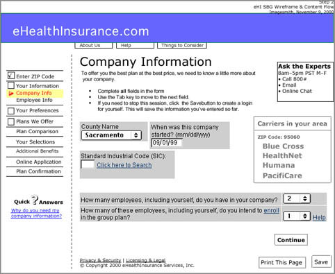
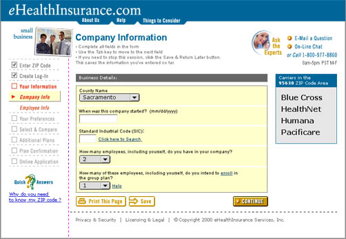
Metaphor (Or Not) and The Interface Much has been said about the use of metaphor in web development. The need to use something familiar so the user can, hopefully, accomplish tasks more easily. Of course many fail, making the interface even more confusing, stripping out expected functionality or hiding it behind silly and confusing interactive 'elements.' Most business models (should I qualify, even this late in the recession, that I mean successful business models?) that have worked online come from successful offline businesses, which means there are models to follow in building an online experience. Erik Perotti, the VP of development at Imagesmith, always recommends interviewing people on how they accomplish tasks offline before walking them through an online representation of that experience or task (usually right before user testing). In this business case, people have been buying health insurance from brokers for decades, if not centuries. eHI is enhancing this experience by providing consolidated and consistent presentation of insurance carriers' plans, policies and prices. As a side note, eHI has exceptional offline customer service as well—while I was walking through the existing experience for the usability audit, I received a call less than 24 hours after completing the first phase of the process, asking if I had any questions about the plan I chose. This was from an experienced broker in their call center. Luckily, many on the team at Imagesmith had experience in health and insurance, so we could draw on these while developing. We defined a metaphor that this site was acting as a broker, so it should present itself as a broker would: helpful, informative; someone to assist you in getting through this confusing and complicated process. We decided to incorporate a 'checklist' of the steps in the process, as well as a list of things a customer will need. The process of looking for insurance is a relatively linear one, as you can tell from the application flow. We provided a list of the steps to the left, which doubled as navigation—in this case, though, it was linear, in that if a customer went back several steps, they had to walk though each proceeding step again—they did not have to retype information though! We greyed out future steps and in user testing we found this accomplished the purpose of informing the customer that they could not get to those pages yet. Other elements to point out are the access to online chat, email and an 800 number. The Quick Answers element in the lower left was a contextual question (or multiple questions) we placed on pages. This was, in the context of the metaphor, much like the explanations a broker would provide while a customer is filling out forms—information to help you feel you are being supported. These were placed in the left-hand column, so as not to distract from the main purpose of each page. We also designed a relational database interface for online help, which provided context for the question asked and additional support for word definitions and related FAQs. This was sketched out, but never formally designed—a piece we thought up, but that was out of scope to fully develop. This was also in support of the metaphor of a helpful broker providing answers to myriad but related questions ("What kinds of insurance can I get?" "What is a PPO?" "Then what's a Preferred Provider?" Paper Prototype & User Testing From Erik's work I built a paper prototype in PageMaker. This was initially used to visualize the flow the team had been working on for weeks. In order to save time, I pasted in screen shots from the existing HTML. Because we were moving so quickly with revisions (reviewing with internal staff at Imagesmith as well as with the client's team) the prototype had to be easily editable. PageMaker was a good choice for this particular project, using a master page for repeated objects. Building in paper allowed for quick revisions, more so than in HTML. A paper prototype is a great tool for user testing, since the person leading the testing can flex and respond to a user's request (perhaps to see a page that isn't built yet). The leader can simply describe what would be on a page, instead of the tester getting a 404 error, or nothing at all.
Download samples pages from the paper prototype (PDF 112K) The paper prototype was used for our first round of user testing. We had the opportunity to find small business owners and HR personnel in small companies to use as testers. The results helped us substantially in the development of the interface and flow. It also helped resolve some sticky issues we came up against in regards to disclosure of information (not legal issues, rather user's comfort level with providing specific details instead of more general details). HTML production moved forward, with some great work being done by Novak Rogic. He provided great insight into how to use Cascading StyleSheets (CSS) and other technologies to provide a smoother, more consistent experience to the user. By involving him early in the process (and, honestly, we should have involved him even earlier than we did!) we were able to enhance our successful flow and interface with successful coding.
Competing Goals—And Groups Unfortunately for the whole team, the company had a very heavy engineering focus, and in order to advance their own business relationships, the interface redesign was put aside. Without money to burn (they are a smart company) and with the completion of our contract in delivering HTML, architectural documentation and design guidelines, our work was done. Although some of our flow work has been incorporated, our main contact (and the champion for our work within the company) soon left and our work has really become more of a great experience and opportunity for learning. It is a great example of disparate groups in a company having unbalanced control and—even more so—business timelines forcing good work to move aside for other goals and needs.
Related Links |
|
© 1998–2007 Scott Robinson